I got a full walkthrough from the VP and product owner — how the CML unit is laid out and how wearing thick gloves, workers checked a paper list, picked trays, and placed them into route-specific racks—manually marking each completed count while handling products, tracking quantities, and verifying locations all at once.

After multiple discussions, the complete information model was on the table. We defined the information architecture—establishing the structure and outlining a solution direction. Once we were clear on the information to surface, the flows, and key user actions, the foundation was set.
I then introduced a design exercise where each team member independently explored how the product could take shape through wireframes and interaction ideas. The intent was simple: to understand their problem-solving approach. While the information architecture was a collaborative effort, the idea generation was intentionally independent—bringing diverse thinking into the process. Overall 6 wireframes were created with different ideas and concepts.
After that in the two-hour team session, I walked through every concept with direct rationale for what wasn’t working and why. The goal wasn’t to correct the team — it was to reframe the problem from how do we fit more onto the screen to how do we show less so the picker can move faster. That shift in framing is what produced the final design.
role
Lead UX Designer
timeframe
4 days
collaborators
2 designers, VP and Product owner
worked on
Tab & Mobile App (Android) · Web App for Admins
key challenge among many
The picker needs everything. Route, rack number, product name, tray count, real-time progress. None of it is optional — miss any one of these and you’re confused in pulling the product for any location.
Multiple pieces of information competed on every screen, forcing the picker to read and parse instead of confirm and move.
Making actions easy to tap with the thick gloves.
Users often get distracted while arranging products on the rack, making it difficult to track where they left off and quickly resume their progress.
solution
✅ Each view shows a single dominant piece of information — the thing the picker needs to act on right now. Everything else is either hidden until needed or surfaced as secondary context below the fold. ✅ Touch targets were rebuilt to span the full width of the display. Not oversized by convention — oversized by necessity. A gloved thumb doesn’t aim; it lands. ✅ The real-time progress counter was pinned to the top of every screen, always visible, always large. The picker never has to search for where he is in the flow.

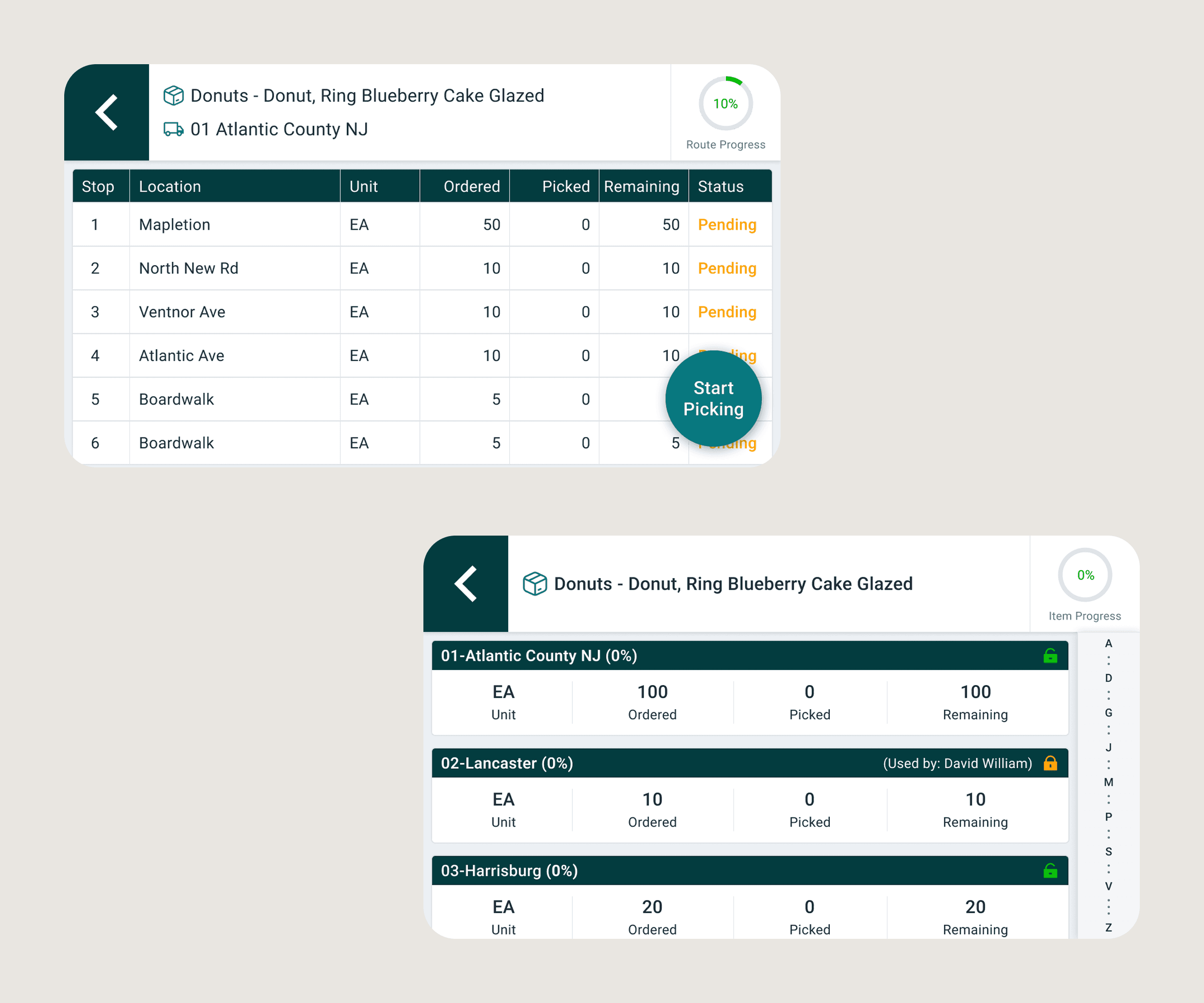
Digital solution was introduced in CMLs
3 days complete design from brief to handoff
The stakeholders reviewed the designs and came back with near-zero revision requests. Not because the design played it safe — but because every decision had a rationale the stakeholders could see and validate.
The team outcome was equally significant. My team who had spent a few days circling the problem watched it get resolved in a two-hour session.Understanding the physical reality of the user’s work first made every subsequent decision faster and more certain. That is the lesson this project left with everyone who worked on it.